THIS POST iS SPONSORED BY MODSY, THE OPINIONS, AND IDEAS IN THIS POST ARE COMPLETELY MY OWN.
Fun fact, my followers have never really seen a picture of my living room, and for good reason. Despite all of the energy, hard work, and inspiration we have poured into our kitchen, entryway, back yard, and garden-level apartment, our living room remains my least favorite room in the house – which is a total shame given all the time we spend in there. With the big pressing projects more or less finished, I’m starting to turn my attention to the rooms that I want to love – because I truly live in them!
So here’s the deal with our less-than-loved living room: it is small, has no windows, has this little door on one wall, and a large opening to the dining room on the opposite wall. That means that furniture placement is super limited and I can only sit two people comfortably in the space. Bummer! I’ve had a lot of time to think about my options, and I’ve been entraining 2 very different directions. Unfortunately, I’m still on the fence about which way to go. I’m hoping you, my internet friends, will chime in and let me know what you think!
Lucky for both of us, I teamed up with Modsy to create a few life-like renderings to help us explore the untapped potential of my sad living room. Pretty cool, right?
In case you are new to Modsy, it’s an online service that allows you to look at furniture and accessories in a highly realistic 3D rendering of your space. I still don’t know how they do it, but all you have to do is upload a few images of your space and before you know it, you are mixing and matching options in a scale model of your space. If you think that sounds like fun, you are totally right! Ready to get this virtual makeover party started? Ok, let’s go!
Option One
The first and by far the simplest option, is to embrace the small footprint of the room and simply add a few appropriately scaled pieces. In addition to its size issue, our living room is also suffering from a lack furniture. Believe it or not, we don’t have a rug, storage, or any extra seating. I know, it’s the classic case of a cobbler’s son having no shoes – I can’t believe it. But, the nice thing about designing a room from scale renderings is that it’s super easy to tell if a piece will work before you bring it home. That is especially nice because it is a small space, and I have no room for error.
So here’s what the space could be. Pretty good, right? I told you the renderings were life like! Going into this project, my number one goal was to add seating. Beyond that, I wanted to create a layered, inviting, well-lit space. I think this option accomplishes that!
Here’s a look at the other side of the room. I am ready for a total refresh so everything here is new! The first order of business has to be the sofa. We love our old one, but this new one is just a little shorter with the same amount of seating. Our current sofa is too long to accommodate side tables, but still only seats two. To a designer, that is crazy talk, and we can do better! This new sofa is a win-win.
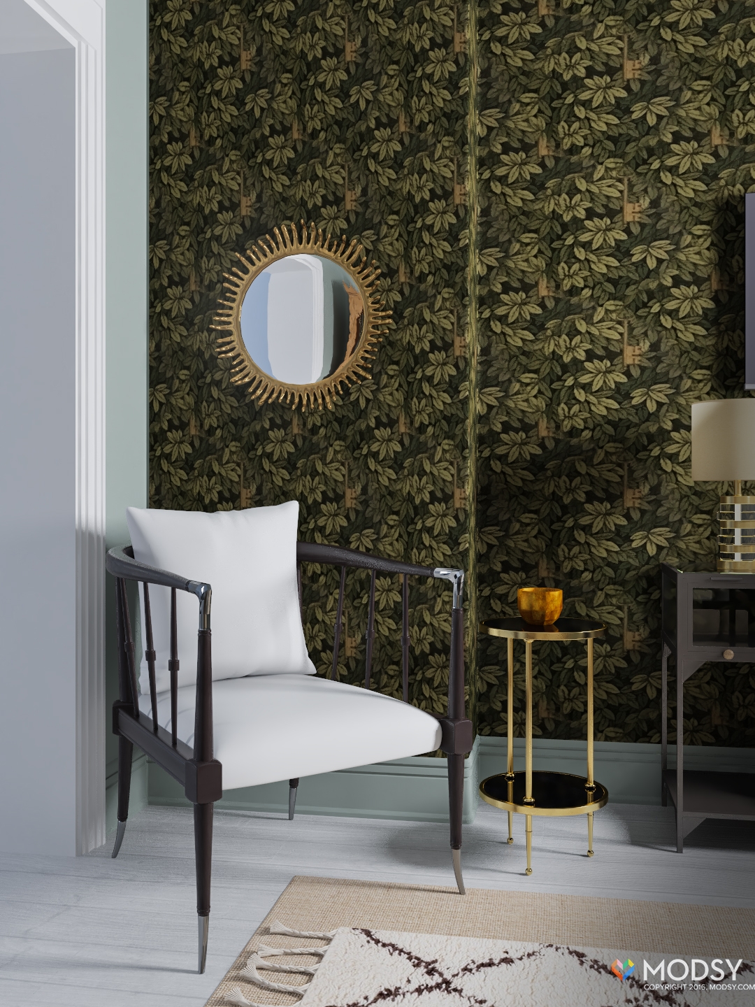
Opposite the sofa I added a smaller occasional chair. I’ve actually tried adding a chair here in the past but because our current sofa was so long it felt a little congested. The new sofa frees up much-needed floor space (another win). I love the wallpaper and knew I wanted to keep it, so I added a couple of strategically place mirrors to help create the illusion of more light.
Layering 2 lighter colored rugs and 2 glass top tables also helped keep the space feeling light and bright. I added a white ceramic chandelier for overhead lighting (on a dimmer of course) and a couple of floor lamps for mood lighting.
We actually watch a lot of television, so if we go with this option, I will be seeing a lot of this view. The console has a light feel because of the glass panels which is super important in this small space. Plus, it is providing some much-needed storage!
Here’s another view of the space looking back into our dining room. But there's more…
Option Two
Ladies and gentleman, I give you option two. The second direction is a much bigger undertaking, but I think it could definitely be worth it. This option involves removing a wall. Specifically, we would have to remove the wall with the black door (check option one) and join the current living room with a similarly sized space on the other side of the wall. I've already investigated, and it is not a load bearing wall so I'm free to demo. The new floor plan would look like this. For reference, the old wall divided these two spaces in half.
I’m not sure what possessed one of the previous owners to divide up the space in its current configuration. My best guess is that it had something to do with creating extra bedrooms. The new space will be bigger and much brighter but it does involve loosing what is technically classified as a second, first floor bedroom. I can’t image anyone in their right mind ever using the space that way, but for the purpose of resale, that kind of thing can matter. I still think the overall payoffs would be worth it.
I used a lot of the same pieces from design option one for this space. However, I opted for a slightly larger chair and added in a new side table and reading light. I also swapped out the white chandelier for these simpler, clear glass pendants. The new space will actually have 2 ceiling lights, so I felt that something simpler was in order.
The wall behind the blue chair with the credenza is the former location of the sofa if you can believe it! My plan is to use the credenza to store my printer and all our home office stuff that desperately needs a place.
As another point of reference, this is the wall that formally had the green Fornasetti paper. If I go with this direction, that beautiful paper will also have to go (my sister just read that and died) -- But don’t worry I have a plan!
Another big change I'm considering as part of this plan is the addition of an opening between the new living room and the hallway. The new opening mirrors the one to the bedroom in size and shape and it sits about where the television was in the first configuration. The new opening really opens up the narrow space and allows for a less constricted flow.
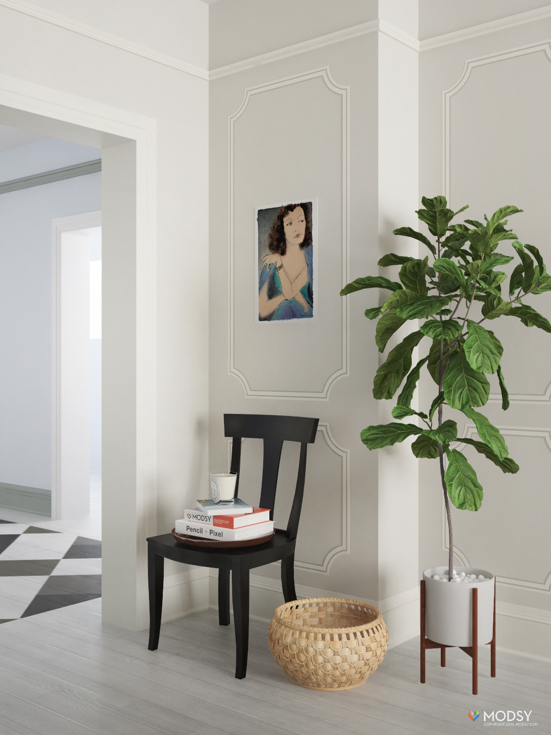
Recently, I’ve been obsessed with decorative painting. So in this second option, I want to try my hand at some DIY trump l'oil moldings. I found this simple molding stencil and I actually think that will make this a pretty easy project.
The other plan I have for this space is adding a (non working) vintage fireplace mantel. Our house was built in 1910 which is just on the cusp of when builders stopped putting in fireplaces. Unfortunately, we ended up on the short end of the stick and I would be thrilled to install one. I was emboldened by the fireplace I successfully made for the One Room Challenge back in October. I think both of those details would go a long way towards making the space feel like it is original to the house.
In this layout, the sofa lives away from the wall. Behind the sofa are French doors that lead to our bedroom. Luckily, that room gets a ton of light. Besides space, one of the primary advantages of option two is that the new living room will get light from two directions!
Rather than using one big rug in the space, I’ve gone with 2 smaller ones. I love the look, but it is something I've never done in real life. Testing an out of the box solutions like this rug combo is super easy when you can use a platform like Modsy to pretty much switch things up endlessly.
Well, what do you think? Option one or option two? I think I have a favorite, but I really want to hear form you. I obviously enjoyed taking Modsy for a test run, and am thankful for these awesome renderings. Now you get to see my vision and judge for yourself! As a designer, I imagine new spaces and renovations all day long, and it’s challenging to visualize how a space will look, even for me. With Modsy’s drag and drop scale model, you can put the math aside and let creativity have free reign!


